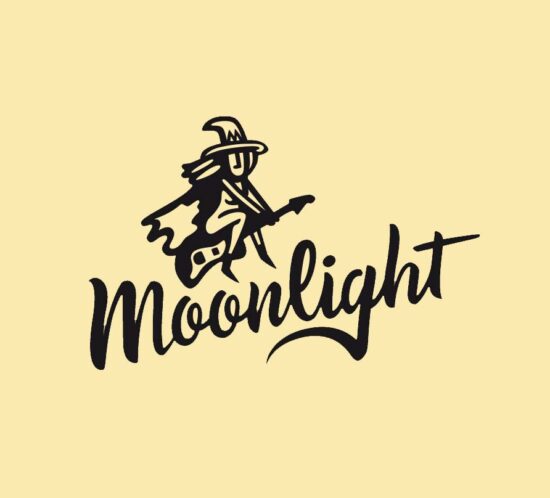
Moonlight

Moonlight, a chameleonic band with a unique sound suitable for all audiences. Always with a carefully crafted and elegant stage presence.

They commissioned us to redesign their logo. Their main icon was a witch, but they wanted to update it to make it friendlier. The same applied to the typography, which needed to better reflect the musical variety they offered.
We worked on the logo with handmade lettering and designed a new witch adapted to the new image.

The Rita’s Forest

Creation of the brand and all the illustrated corporate image surrounding The Rita’s Forest.

Each illustrated packaging revolves around a popular legend from different parts of the world.

Tam Tam

Logo for the Tam Tam choir.
A choir whose entire repertoire is a cappella, at most accompanied by percussion. Most of the songs they sing are gospel, of African origin.
The most important part of a cappella choirs is the voices, which is why we were inspired by the 4 sections that make up the choir, giving each section a stroke. Just as songs are composed, we played with finding different harmonies with the 4 strokes to form the word “Tam Tam.”
While playing with the lines, we noticed different motifs appearing that will help us continue the corporate image.
Result: A modern, timeless logo with an African style.

Daggas

Creation of the brand, the characters (neurotransmitters), and all the illustrated corporate image that brings the Daggas brand to life.
A complete system of self-awareness and personal growth based on neurotransmitters.

Vila Santa Lucia

Creation of the brand and corporate image of Vila Santa Lucia.
A luxury rural house on the edge of Cabrerès.

Repatria Medica

Corporate image of the company Repatria Medica .
Brand design, corporate stationery, web and infographic illustrations.

TECHNIQUE .

Lettering, digital

Brand history

Some of the brands and logos we have been creating in recent years.

Vicactiva’t

Illustration of the informative infographic of the sports project of the city of Vic, representation of the sports facilities and their disciplines of the city. Design of the Vicactiva’t brand.

Arapla!

Conceptualization of the image of the Araplà cultural magazine collection. Always playing with two inks and overprinting.

TECHNIQUE

Photography and digital, offset printing in two inks