Museu l’Esquerda

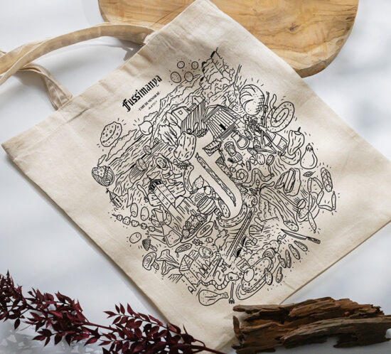
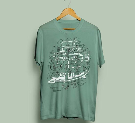
This illustration was specifically designed for printing on t-shirts, recreating the Esquerda archaeological site. It displays the map of the excavated area, along with figures representing the people of the time engaged in everyday activities. In the foreground, contemporary archaeologists are depicted, still working on-site.

The goal is to offer a unique piece that connects the past with the present, available on t-shirts and totebags sold at the museum.

In addition, we handled the screen printing process in an artisanal manner, using eco-friendly inks to ensure an environmentally respectful process and optimal quality of the products.

En Canta, illustrated totebag

A new edition of the illustrated bag for the En Canta festival.

Following the same concept as each edition, we illustrate a totebag with 2 colors. This time, featuring fantastic characters playing instruments or enjoying the concerts.

Screen-printed by us with handmade serigraphy and ecological inks.

Fussimanya

Illustration and printing of the bag for Fussimanya.

In the illustration, we have made the “F” of the logo appear in negative space, surrounded by elements that are part of the stores, restaurants, and representative areas of the towns where there is a Fussimanya store.

In this case, we also took care to do the screen printing ourselves in an artisanal way, using eco-friendly inks.

La Caseina

Illustration and printing of the tote bag for the store La Caseina de Vic.

In this case, we also made sure to do the printing ourselves, using handmade screen printing and eco-friendly inks.

Cal Formatger

Illustration and printing of the tote bag for the store Cal Formatger in Girona.

In the illustration, they wanted both locations to be featured along with typical elements of the city of Girona.

In this case, we also made sure to do the printing ourselves, using handmade screen printing and eco-friendly inks.

Moonlight

Moonlight, a chameleonic band with a unique sound suitable for all audiences. Always with a carefully crafted and elegant stage presence.

They commissioned us to redesign their logo. Their main icon was a witch, but they wanted to update it to make it friendlier. The same applied to the typography, which needed to better reflect the musical variety they offered.
We worked on the logo with handmade lettering and designed a new witch adapted to the new image.

The Rita’s Forest

Creation of the brand and all the illustrated corporate image surrounding The Rita’s Forest.

Each illustrated packaging revolves around a popular legend from different parts of the world.

Tam Tam

Logo for the Tam Tam choir.
A choir whose entire repertoire is a cappella, at most accompanied by percussion. Most of the songs they sing are gospel, of African origin.
The most important part of a cappella choirs is the voices, which is why we were inspired by the 4 sections that make up the choir, giving each section a stroke. Just as songs are composed, we played with finding different harmonies with the 4 strokes to form the word “Tam Tam.”
While playing with the lines, we noticed different motifs appearing that will help us continue the corporate image.
Result: A modern, timeless logo with an African style.

Daggas

Creation of the brand, the characters (neurotransmitters), and all the illustrated corporate image that brings the Daggas brand to life.
A complete system of self-awareness and personal growth based on neurotransmitters.

Vila Santa Lucia

Creation of the brand and corporate image of Vila Santa Lucia.
A luxury rural house on the edge of Cabrerès.